XYZ Jewels — Abandoned Cart Recovery Email
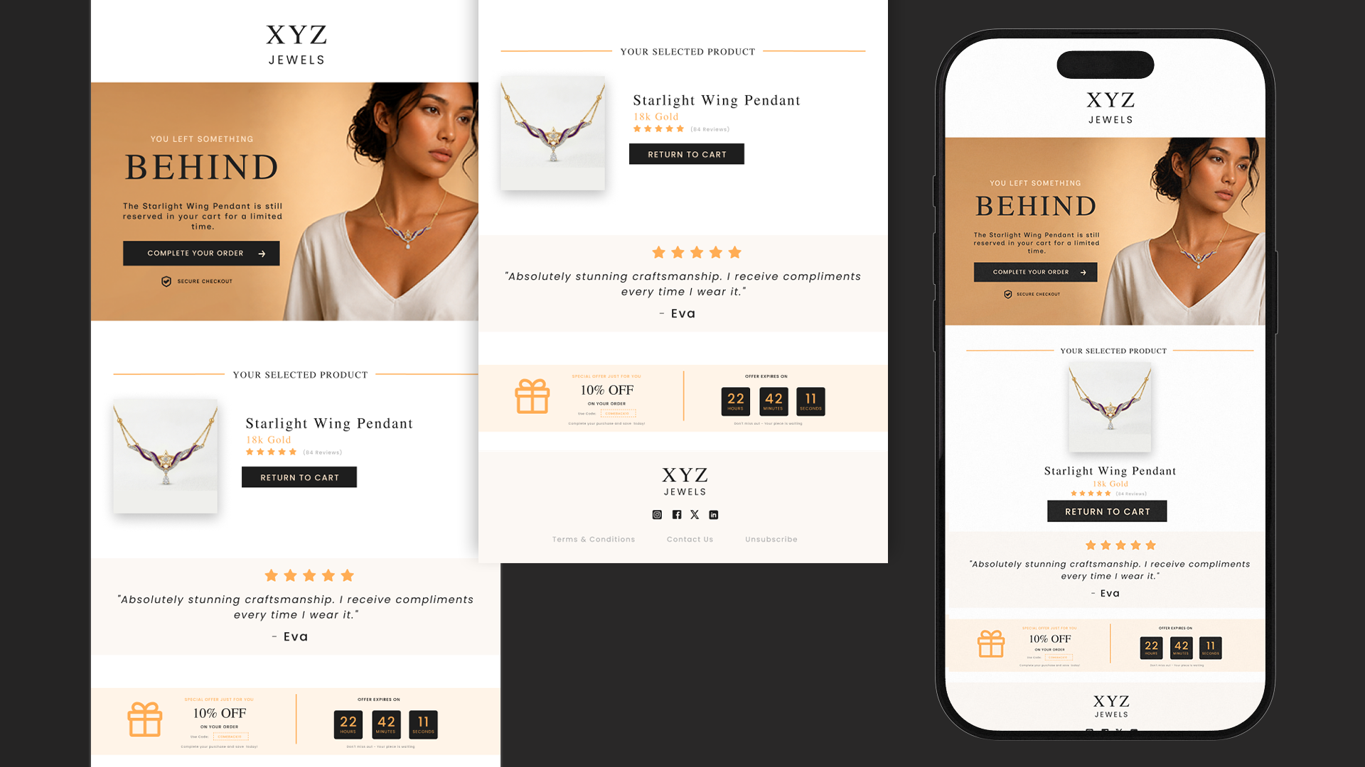
Designing a premium abandoned-cart email experience for XYZ Jewels that combines product reminders, social proof, urgency, and a clear call-to-action to encourage customers to complete their purchase. The design focuses on maintaining a luxury jewelry aesthetic while making the recovery journey simple, persuasive, and conversion-focused across desktop and mobile.
Client
XYZ Jewels
Timeline
1 Week
Role
UI/UX Designer & Email Designer
Stack
The Challenge & Design Approach
Customers often add products to their cart but leave before completing their purchase. For a premium jewelry brand, a simple reminder isn't enough — the experience needs to feel personal, elegant, and trustworthy. The goal was to create an abandoned-cart email that reminds customers of the product they were interested in while reducing hesitation and creating a reason to return. The design direction focused on a minimal luxury aesthetic, using editorial typography, warm neutral tones, premium product imagery, and a strong visual hierarchy.
The Conversion Experience
The email was structured around a simple conversion journey: remind → reassure → incentivize → convert. The hero section immediately communicates “You Left Something Behind” with a prominent “Complete Your Order” CTA. The selected product is then brought back into focus with its image, price/material information, rating, and a “Return to Cart” button. To reduce purchase hesitation, a customer testimonial provides social proof. A limited-time 10% discount and countdown timer then introduce urgency, encouraging the customer to complete the purchase before the offer expires.
Responsive Experience & Final Outcome
The experience was designed to work across both desktop and mobile screens. On mobile, the content is reorganized into a vertical flow while keeping the most important elements — product, testimonial, offer, and CTA — easily accessible. The final design turns a basic abandoned-cart notification into a branded shopping experience that combines luxury aesthetics with conversion-focused UX. The key takeaway was simple: effective cart recovery isn't just about discounts — it's about reminding customers why they wanted the product in the first place and making the next step effortless.